Scott Carver

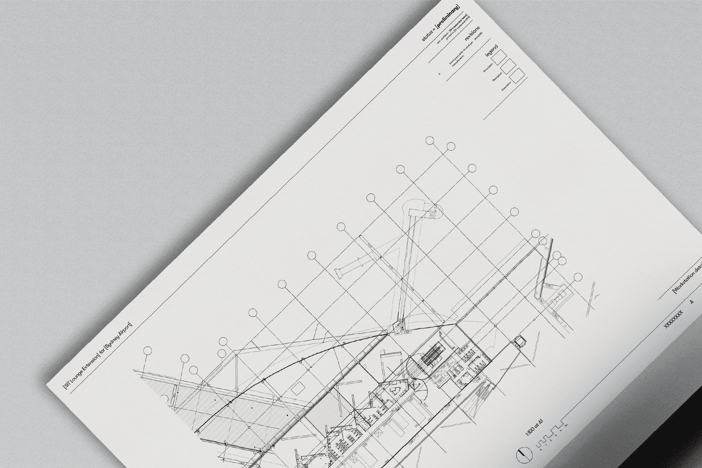
Scott Carver’s redesigned identity is built around the mathematical precision of the equals sign—a symbol of balance, clarity, and direct communication. This approach translates into a visual shorthand, reducing complexity while amplifying meaning through language, numbers, symbols, and hierarchy.  


A black-and-white foundation reinforces the identity’s pragmatic and textual nature, while selective color accents act as graphic punctuation, drawing attention to key interactions and shorthand elements. An adaptive grid, rooted in the rule of thirds, structures content with rhythm and consistency.  


Beyond a visual system, this identity functions as a design language—giving Scott Carver’s architects and designers a unified framework for expression, communication, and engagement with clients, employees, and future talent.

Year
2015
Year
2015
Year
2015
Year
2015
Credits
Tanel August Lind
Credits
Tanel August Lind
Credits
Tanel August Lind
Credits
Tanel August Lind
Tim Kliendienst
Tim Kliendienst
Tim Kliendienst
Tim Kliendienst
Penny Bowring
Penny Bowring
Penny Bowring
Penny Bowring
Links
https://scottcarver.com.au
Links
https://scottcarver.com.au
Links
https://scottcarver.com.au
Links
https://scottcarver.com.au
https://www.twitter.com/scottcarver
Made at Alphabet
Made at Alphabet
Made at Alphabet
Made at Alphabet
Scott Carver is an award-winning architecture and design firm based in Sydney. The objective of the rebrand was to simplify Scott Carver's message, making it clear and memorable, to show what the firm stands for to clients and itself.
All Rights Reserved
Copyright ©2025
All Rights Reserved
Copyright ©2025
All Rights Reserved
Copyright ©2025
All Rights Reserved
Copyright ©2025